|

|
Odin
Hot Toys

"The
following is a guest review. The review
and photos do not necessarily reflect the opinions of Michael Crawford
or Michael's Review of the Week, and are the opinion and work of the
guest author."
|
Jeff checks in with a look at
Thor's dad, Odin - take it away, Jeff!
When it comes to the rules of engagement in combat with Frost
Giants, then Odin’s your man! However if you need an insight to the
hottest collectables and figures on the market, then look no further
than this site… thanks to our very own sage and oracle, Mr Crawford.
I
have to admit that when I approached the Thor movie it was with more
than a little trepidation and also as something of a curiosity.
Why?
Well
because I also have to admit that as a lad the titular god of thunder
never really did it for me, even when very young he just seemed a
little bit too silly. OK, OK, I know that with super hero comics you
just need to ‘let go’, and for whatever reason I found it totally
acceptable that a teenager could be bitten by a radioactive spider and
develop superpowers or that a research scientist could be mutated after
being bombarded with gamma radiation… go figure!
However, Thor
was always that ‘leap of faith’ too far. Even when I heard it was the
next Marvel character to get the big screen makeover I still wondered
if it could actually work with modern ‘sophisticated’ audiences.
But
then I heard Kenneth ‘the luvie’ Branagh was directing, and I sat up a
little, then the cast started to be named and I really sat up. At that
point I knew I had to at least go see it… so I went and surprisingly
enough I thoroughly enjoyed it!
As far as Marvel movies go, it
wasn’t quite Iron Man 1 or Spidey 2 good, but it was entertaining, and
had some well paced action set pieces, and it certainly added to, and
built on the whole ‘real world’ Marvel universe. Setting Thor up nicely
for the forthcoming Avengers movie.
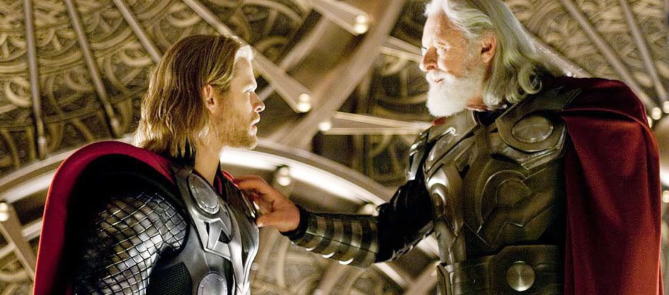
Mike already looked over his wayward son Thor
last week, so I figured I’d jump right on in with his dear ol’ pappy
Odin. It was quite a shrewd move to put Branagh on directing duties for
this movie, as within the circles that proper thespians move, he is
very much respected, and had just the right sort of clout to get actors
of a certain calibre interested. Amongst these was Sir Anthony Hopkins,
an actor, that by his own admission has been ‘phoning it in’ with a lot
of the ‘Hollywood’ roles he’s played recently. And yet here, whilst
working under Branagh’s direction, he actually managed to bring pathos
and depth to a character that could so easily have turned out oh so
very two-dimensional.
So if you are investing in Thor for your
display, do you need his imposing father ‘The King of Asgard’ at his
side, well I’ll try and help you decide.
|
|
|
|
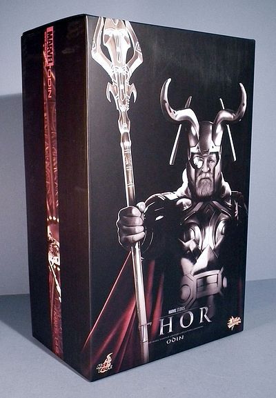
Packaging
- ****
Last
week I reviewed the Ghost Rider figure, and pointed out then that the
Marvel characters have so far all followed the same design principles,
especially in their construction. So once more we have a relatively
straightforward ‘lift off’ lid box design. Inside is a full colour
printed card overlay with a brief character description, then the
figure is held on the top layer and his spear and stand are on the
lower layer. So nothing particularly untoward or bad to report! My only
problem here is with the images that were obviously made available for
Hot Toys to use. The Thor box had this
striking and iconic image, as used on much of the promotional
literature and indeed posters for the movie. But the image on the front
here is just a little uninspiring, which is a shame as the figure
within is actually pretty impressive.
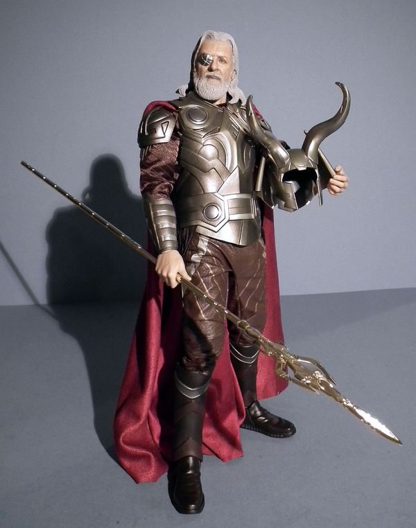
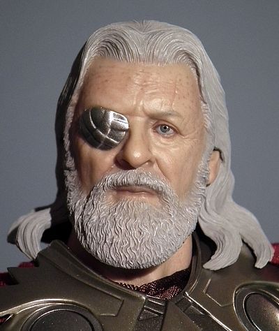
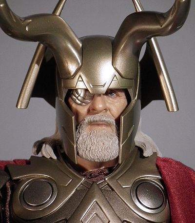
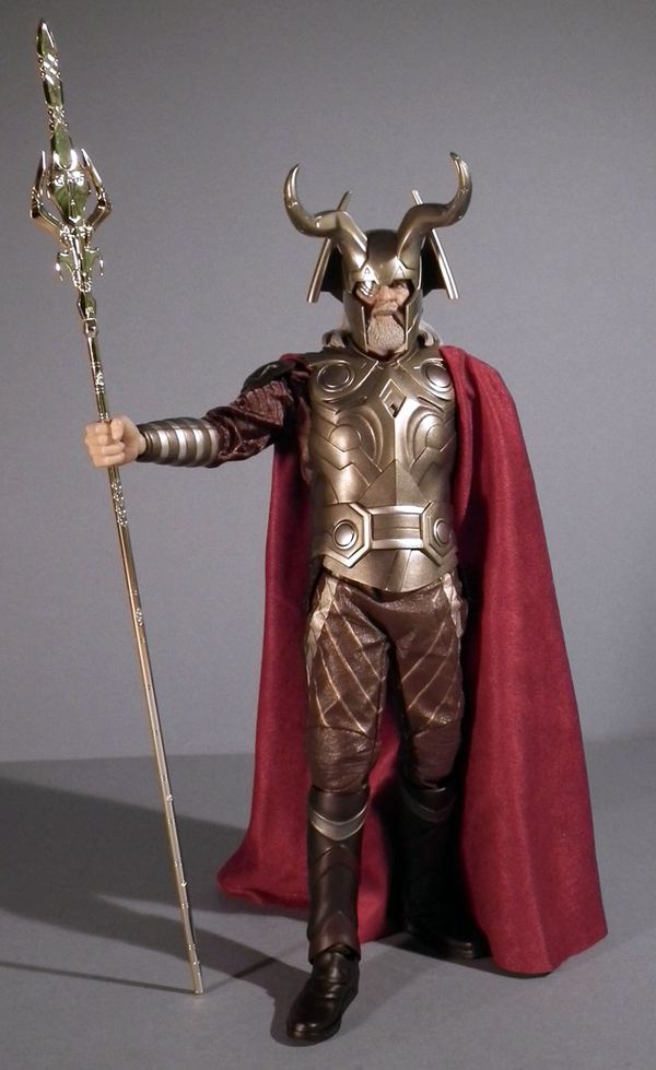
Sculpting - ****
Every
now and then a figure comes along that ‘even’ my wife loves, though
there was a moment of befuddlement and confusion when I first showed it
to her. Knowing she likes Hopkins I said what do you think of this? She
smiled and said that it was an AMAZING Oliver Reed likeness, my jaw
hung for a moment, “What”’ I said “It’s Anthony Hopkins!” to which she
said “that’s what I meant”, and I’m glad to say she really did mean it…
synaptic glitch, I hope she doesn’t read this.
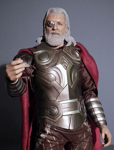
In the movie,
Odin was once and indeed still is quite the warrior, but due to an
earlier encounter with the Frost Giants, he is now sadly cycloptic,
meaning his left eye is permanently covered with an ornate metallic
patch, which seems to stay put magically (though I’m guessing it’s the
false eye equivalent of a babies pacifier, you really don’t want to be
in the room when he ‘pops’ it out.
This patch is made of a
separate piece which is glued over the top; this gives a nice layered
effect. The facial expression is the passive side of determined, making
for some good general poses, but not so great for the more dynamic
action stances, but as Odin is meant to be a man in the late Autumn of
his life, I guess that’s not too much of an issue. The detailing in the
pore texturing, lines, wrinkles and scars covering his skin is deftly
carried out, as is the fine whisker detailing for his beard. Once again
Eom Jae Sung (GOX) is in control of this, under the art direction of
KoJun, I was hugely impressed with the work he did on the recent Nick
Cage portrait and also of Thor himself, and with the recently unveiled
Captain America sculpt under his belt, he seems to be getting the pick
of the recent Marvel jobs.
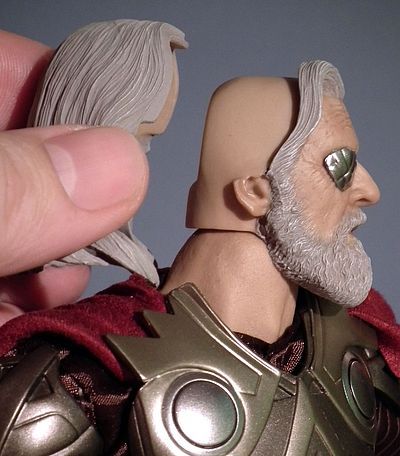
You get two versions of the rear of
his head; both are expertly detailed with plenty of deep crisp detail
in his long flowing locks. The difference is that one is slightly
fuller, sticking out more towards the back for when he is helmetless,
while the other is showing him in ‘hat head’ mode, so its formed to fit
neatly within the confines of his elaborate helmet. It curls around at
the front where it lays over his shoulders, and if you position
everything right it can fall in such as away as to look relatively
convincing. The trouble is with a style like this is that it will never
look 100% natural, but this is a very good approximation.
He also comes with a selection of nine hands-
2 fists
2 spear grip
2 relaxed/ light holding pose
1 right spear angled /pointing
1 left gesturing
1 left open palmed/fingers spread
All
are sculpted well, but I did notice the top part of the opening on the
left hands spear grip was rather crudely finished, looking like an
exact drilled out hole rather than the natural form that the fingers
would take. This is however a very nit-picky observation, as once the
spear is in the hand (which is basically the only reason you would use
it) it looks absolutely fine.
Paint
- ***1/2
Perfect* ‘yadda, yadda’, subtle* ‘yadda, yadda’, life like* ‘yadda,
yadda’!
I
know I could just carry on like this, however, on this occasion it’s
not quite as perfect as some others have been in the past, but when
compared to the competition, then it’s still way up there. Nonetheless
I had just enough of an issue to keep this from the top spot.
I
have no problems with the flesh-tones, which are as ‘lifelike*’ and
‘subtle*’ as ever, and the super glossy eye is also as accurate and
‘perfect*’ as we always expect. I will especially draw your attention
to the super fine and delicate work on the age spots that pepper his
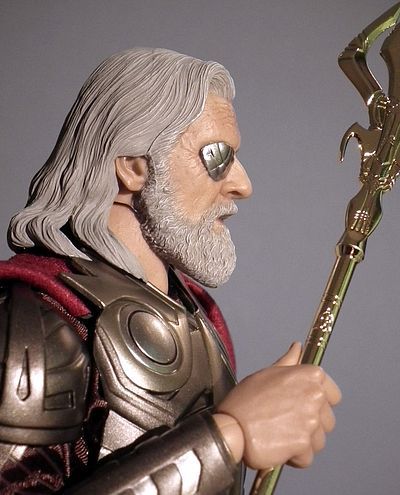
forehead and temples, just outstanding. But on this version the paint
on the hair doesn’t work quite as well as I had hoped it might. In the
past, when working on people with darker hairstyles then the ‘one
colour all over’ approach can be complementary in letting the sculpting
shine through. Creating the differences in tone by the way that the
light and shadow respond to the surface. But here the large slab of
grey ends up looking like just that… a large slab of grey!
It’s a
shame, as the sculpting is all there, and the likeness is sublime, but
the dull grey tone seems to if anything flatten the sculpting rather
than helping to enhance it. Looking at stills from the movie, it
strikes me that a much lighter tone may have worked better as pics like
this
or this
show that from certain angles it looked virtually white.
Of
course if you plan on displaying him in his helmet, then this will be
much less of an issue for you, but I had hoped to pose him with his
helmet under his arm, so I wish just a little more work had been
carried out in varying its tonal values.
Ultimately this is a good job… but it’s certainly not their very best
job!
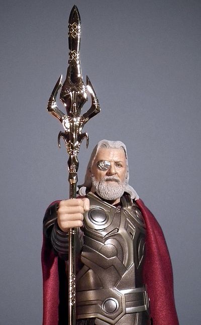
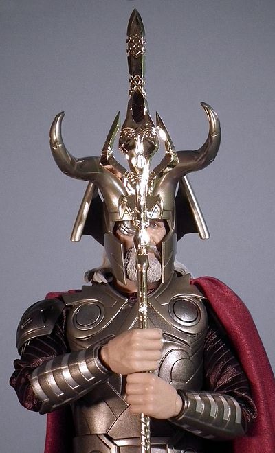
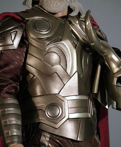
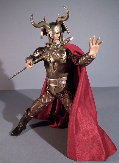
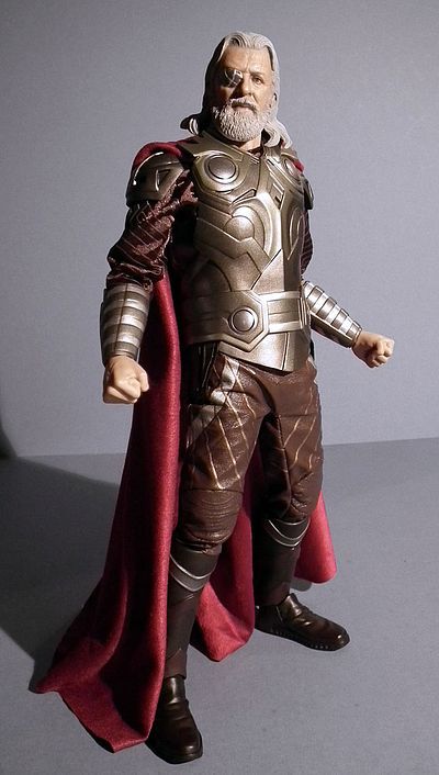
Outfit
- ***1/4
The
aesthetic for the inhabitants of Asgard is meant to represent a society
that is at the top of its game, a virtual utopia, all be it one that
seems to be in a feudal state with a number of its neighbours. Also the
characters we see in the movie are the kings, noblemen and hi-cast
warriors, so their clothing, armour and weapons all looks shiny and
new, almost more like ceremonial accoutrements, rather than ‘every day’
items of combat. Don’t get me wrong. It’s a bold and striking look, but
it does seem to owe more the 1980 ‘Flash Gordon’ movie or even (dare I
say it) a Power Ranger, rather than the lived in and used look of say
‘Lord of the Rings’. However as this is meant to be a mythical,
technologically advanced society, I guess that’s OK, but it still all
looks just a bit too perfect for my liking (can you tell I’m actually
arguing with myself over this one).
As far as actually looking
like the screen seen outfit goes, then this is over 95% there, but as
far as functioning like it, then it’s sadly just a little lacking in
this department. The main reason for this is the moulded part of his
armour that fits over his torso. It’s well sculpted to represent all
the interlocking panels, sections and belt, but ultimately it’s all one
big piece. And some of the colouration doesn’t look as golden as
perhaps it should. If you check out the pics in the link here
you can see just how detailed and how golden I actually mean. But what
they taketh with one hand, they doth delivereth with the other, as his
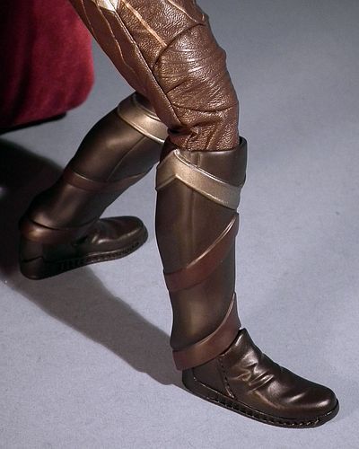
boots are of a similar construction to the ones on the Ezio figure from
Assassins Creed figure I reviewed a few months back here,
meaning that the camouflaged join at the ankle gives a full range of
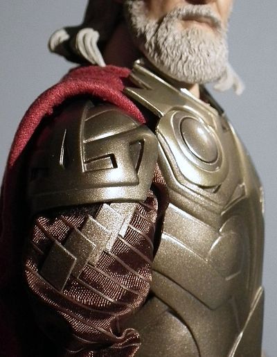
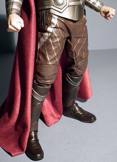
movement in all directions. Next up are his elaborate pleather
trousers, these have cushioned knee pads, printed metallic details and
embossed lines criss-crossing over their surface, and they are loose
enough to not be too constrictive on the leg articulation. Under the
torso armour he sports a brown satin long sleeved shirt with embossed
diagonal pin-stripes. This has removable armoured shoulder pauldrens at
the tops of the arms (these can be lifted off as they are kept in place
with Velcro) and armoured gauntlets over the forearms. Over his
shoulders he has a long sweeping red cape. The fabric used here is good
and heavy, and unlike Thor, you don’t need to attach it, it comes
already fixed in place. The pleats where it falls over his shoulders
are glued in position in quite an elaborate fashion to a solid ‘yoke’
that keeps everything in place, and there is enough material left loose
on the left shoulder to be able to drape it round over the front.
This is actually one of my favourite parts of the outfit, simple, but
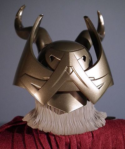
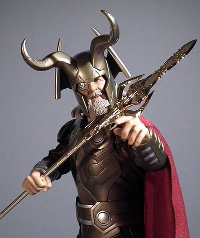
elegantly executed. Last up is his helmet, and boy, what a helmet it
is. Its close fitting to the skull, with deep extended cheek guards, I
guess you could say ‘Magnetoesque’, but it then has sweeping, scroll
like wings that radiate out from its rear, and lastly a pair of
magnificent curved horns erupting from the front. It’s a design that
borrows heavily from many historical types of armour, but is obviously
meant to be most evocative of heroes from Germanic Norse legends, but
with a slight industrial ‘techno’ twist. Every schoolboy worth his salt
knows that Vikings didn’t actually wear horned helmets, but when a
misconception is as deeply rooted in culture as this is, you’d be
stupid not to utilise it, and it certainly gives Odin quite a dramatic
presence, and as he isn’t a Viking anyway, but rather an ‘mythical’
Asgardian, who cares?
Articulation
- ***
Sadly all that thick bulky
armour does impact a little
negatively on this guy’s poseability. I haven’t actually disrobed him,
as it looks like it could potentially be quite destructive to do so.
This means I haven’t actually seen under his clothes so I can’t
actually 100% see what the base body is. But after a little light
groping, it feels like a hybrid of the upper chest and neck of a stocky
muscle body (think Barney Ross) with a classic True-Types arms and
legs. So the basic functionality of the body is not in question, it’s
just the way it interacts… or doesn’t, with the outfit.
There’s
really not too much to worry about as Odin is an older character, and
the poses that most will want are general standing and perhaps a few
with his spear held in combat positions, and to be fair he is more than
capable of these, just don’t approach it expecting any ultra deep
stances.
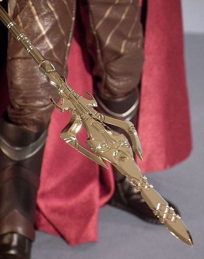
Accessories
- ***
This
release is pretty light in the accessories department, and like in the
outfit section, it suffers from the curse of the ‘overly perfect’
ceremonial weapon, rather than an earthy, visceral bladed spear. This
is obviously screen accurate, but it is achingly shiny and the
‘perfection’ of it does make it look just a tad plasticy. However, I
still need to continue arguing with myself as I could only find this
out of focus pic
of the weapon… and it sure is shiny!
He
basically comes with the selection of hands described in the sculpting
category, of which you could consider seven of them extra accessories,
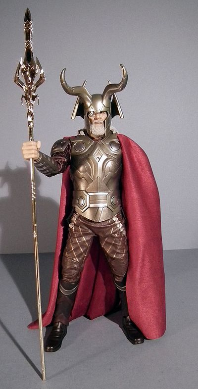
then there’s his long spear, known as Gungnir or ‘the Spear of Heaven’.
This is meant to be made of the mystical metal of Uru, and is enchanted
to return to Odin’s hand, it is the same material that Thor’s hammer is
made of, hence it returns in the same way to its chosen wielder. Next
up is the extra hairpiece for when wearing the helmet, and lastly the
old trusty black figure stand. This is one area that they could have
been a little more creative, as a joint interlocking base showing an
ornate section of ‘Asgardian’ floor for Odin, Thor… and hopefully Loki
would have certainly added to the display options.
As it is, we
get all we need for solid display piece, but if just a few little
extras had been included it could have helped in it’s over all value.
Fun
Factor - ***
If you are
looking for a ‘fun’ figure then his son is much more the action man,
but even he suffers from a degree of restrictiveness in terms of his
outfit. Of course if you are a hardcore Thor fan, or just aiming to get
every character that is linked to the numerous Marvel licences, then
you will undoubtedly feel more positive about the whole ‘Odin’
experience. And in terms of looking like a wise but seasoned old
warrior, then with the helmet in place he certainly looks every bit the
sagely badass! However, as we say till we are blue in the face, this is
an adult collectable. If you were insane enough to buy this for a kid,
then I guess in a perverse way you actually deserve to end up gluing
him back together at the end of a days play. That said, he is
definitely robust enough to stand up to plenty of posing and
repositioning from an experienced Hot Toys enthusiast, but do make
yourself familiar with the instructions provided so as to avoid tears
before bedtime!
Value
for money - ***
There
is a lot to like here, but there are also a few issues that keep it
from becoming a favourite. Had the painting of the hair been handled
just a little differently? Had the torso armour had a just a little
more flexibility and been fabricated with more mixed media, and had he
come with perhaps just a few more accessories then I’d have been a lot
happier. And the fact that he lacks these things and still
comes
in with a RRP of $169.99 makes me feel that his price is a little on
the steep side. Being a long time dedicated hi-end collector I usually
tend to be more tolerant and conditioned to the prices that modern
1/6th goes for, and to a great degree I am mostly preaching to the
converted. However, Mike has a wider demographic in mind, which I can
totally respect. But on this occasion the price does seem to be at
least $20 too heavy even for the dedicated hi-end collectors. I’m
guessing the fact we have a hefty Marvel ‘summer blockbuster’ licence,
coupled with the use of Hopkins likeness may be playing a greater part
in this.
Overall-
***1/4
There is much
to like here, and the problem solving in the way they have tackled this
complex outfit is in many ways commendable. However the way it has been
finally constructed, coupled with the ‘Flash Gordon’ aesthetic in the
actual movie makes this one just not quite as special as I had hoped it
would be. Then the lack of accessories and rather flat paint app on the
hair push this one even further away from a full score. But the straw
that breaks the camels back is the price. Had this been a $150 figure
it would have got half a star more, but taking everything into account,
then this feels like a figure that just limps over the three star
category. And the quality of the portrait makes that a real shame.
Where to buy
Online options include these site sponsors:
- Capstone Comics
has the pre-order at $153, but may already be sold out.
- Alter Ego Comics
has Odin for $153, but are sold out of Thor.
- Fanboy Collectibles
has him on pre-order at $155, along with Thor.
- Super Power
Collectibles doesn't have Thor, but they have Odin at $159.
- Big Bad Toy Store
has him at $160, along with Thor.
- Hollywood Heroes
has the price at $170 each for either character.
- Sideshow
has him at $170.
- Urban
Collector has Thor at $180, but is sold out of Odin.
- or you can search
ebay for a deal.
|
Did you enjoy
the review? Plus 1 it!
Google +1

This product was provided free for the review by the manufacturer.
Photos and text by Jeff Parker.
|
