|
When I heard that there were figures being produced for the game, I had hoped someone like SOTA or Joyride would have snagged the license due to their already excellent video game figure selection, but instead Jazwares snapped it to go along with their Mega Man license. The early photos gave me hope, but a lot can change between first shots and final product. Mr. Crawford has already reviewed Sub-Zero and
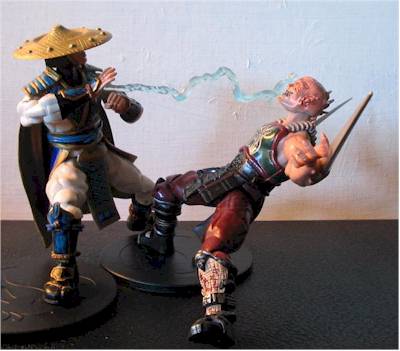
Baraka. Tonight I’ll be covering Raiden and Scorpion.
Packaging - **
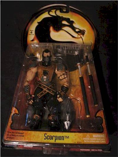
The packaging is very simplistic: a key-hole shaped backer card with a trapezoidal blister on the front. The bubble shows off the figure pretty well, but is easily damaged. The card art is generic all around. I would have liked a character write-up on the back as opposed to a group shot of the first four figures.
Sculpting - Scorpion: **; Raiden: * ľ
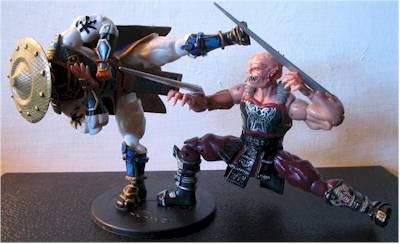
All I have to say is what a let down. The graphics in MK Deception were among some of the best character designs I’ve ever seen in a fighting game. The detailing and costuming were excellent and could have made for some great action figures.
However what we got here is the low budget version. You can tell that the original designs on these characters are good, but the final products are severely lacking. A lot of this has to do with the poor plastic used, but the flaws are really brought out by the paint and weird articulation style –but more on that in the other sections.
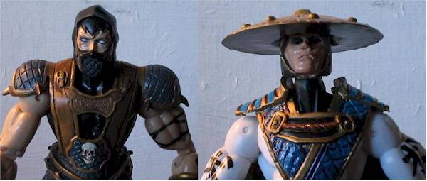
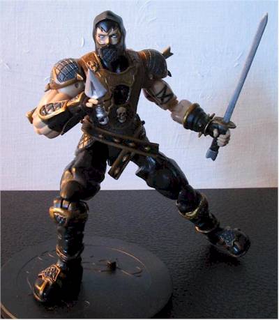
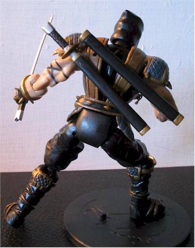
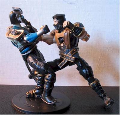
Scorpion’s not too bad. The head sculpt and armor designs are close to his game counterpart, but the bulky legs and arms are a bit goofy. Also, his legs are sculpted in a bit of a knock-kneed position as well. There’re a bunch of large ugly molding spots to be seen all over his body, including ones on the side of his head, back of his heels, and on the front and backs of his legs.
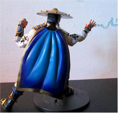
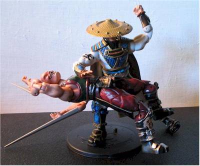
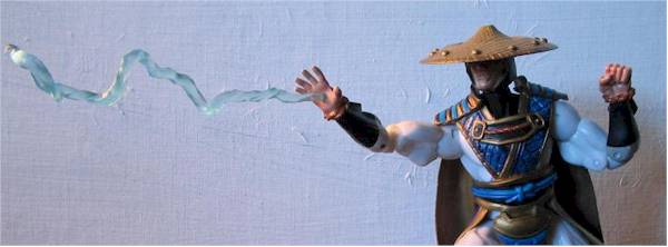
Raiden is the biggest surprise of the bunch and not in a good way. I guess he’s just photogenic, because he looks halfway decent in all of his pictures –of course, you can’t see his face in most of them either . . . In person it’s a much, much different story. His armor is roughly sculpted and glued together piecemeal. He shares the same bulky body sculpt as the other figures, but his knock-kneed-ness isn’t as bad as Scorps’. There are molding marks and swirls galore on this guy –luckily they are hard to see in the white plastic from a distance.
And now we come to the head sculpt. Confusion abounds here folks. First off, the head appears to be glued into the hat sculpt as opposed to one piece. The head itself is shot in clear plastic then painted over except for the eyes. Supposedly Jazwares was going for the light pipe effect, especially since Raiden is advertised with “glowing eyes”. It’s kind of hard to get them to light up when there’s no opening for the light source to shine through . . .
The solid piece of clear plastic is a testament to the cheap production values on this figure. A solid colored piece hollowed out with clear inserts in the eyes would have been much better, like on the early Kenner-released Terminator figures, or the R2-D2’s and Jawa’s Hasbro has done over the years.
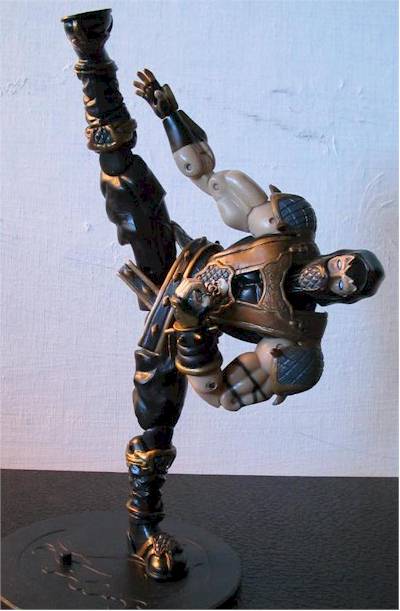
As a final note, let me tell you I meant it literally when I said Raiden shared the same body sculpt as the other figures. All four figures have the same exact sculpt from the neck down to the knees and elbows. It’s a nice blatant look at how cheaply these figures were made.
Paint - Scorpion: **; Raiden: * ˝
Scorpion has a pretty simple paint scheme: mainly black and gold. There’s plenty of bleeding to be found, especially on his face. There appears to be black smudges around his eyes. In general, there are black smudges everywhere –especially on the gold highlights around his boots. I’m sure this is supposed to be some sort of wash, but it just looks like crap.
Raiden’s worse. His main body is shot in white. The only clean ops are the symbols on his biceps. All the vibrant blue on his armor looks decent from a distance, but is an absolute mess close up. There’s dark blue paint smudged all over to simulate a wash. Eek.
The face is absolutely horrible. The paint is a complete mess on the clear plastic. The eyes are partially painted over in areas and the edges of the hood are missing paint in spots. The black smudges make another appearance here as well. It almost screams bootleg.
Articulation - **1/2
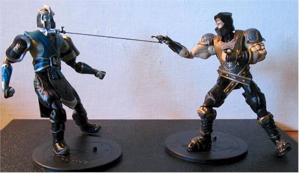
For figures that sport 18 points of articulation, this is a pretty low score –but there’s a reason. Each figure has ball-jointed heads, shoulders, hips, double pins at the knees and elbows, and swivels at the biceps and wrists.
The joints are universally weak. The stands are definitely needed for any poses other than basic standing. If the plastic wasn’t so weak, I would have easily bumped these scores up.
Some of the joints like the left shoulder and the hips are strangely limited for some reason. The plastic pinches in some spots and is constricted by the soft rubber armor. The wrist joints are pretty weak on these guys too. The hands come off a bit too easily, as does Scorpion’s head. In fact, it fell off the moment I pulled him from the package.
Durability - *
The plastic sucks, the joints are weak, the paint is sloppy, Scorpion’s head keeps popping off, Raiden’s head should be popped off, and the accessories are cheap. Did I miss anything?
Accessories - Scorpion: **; Raiden: *
Scorpion could have had the best rating in this category out of all four figures, but the cheap materials used really ruin Toasty-boy’s toys. Scorps comes with two swords, two sheaths, his flying spearhead, and a stand. Where to start . . . well, the moment I tried pulling the longer sword out of its sheath the blade snapped at the hilt. The plastic is so freakin’ thin and fragile that they’re next to useless. You have to baby them into poses and they don’t even sheath all the way, leaving a section of the blade exposed and prone to easy breakage. The sheaths have two pegs to attach to the back of Scorpion’s armor but you can only get one peg in for each, otherwise they’ll just pop off. Clips would have worked better.
The spearhead looks like the Deception game design and is tied to a short string that’s connected to a small ring that snaps into Scorpion’s open palm. I like this idea but the string should be longer. You can always replace it yourself I guess.
Raiden is the definite loser out of all four figures. The god of thunder and lightning comes with a single lightning bolt and his stand. The bolt snaps into his open hand and looks okay, but is a bit fragile around the end. You’ll have to be careful attaching it or it might snap.
What’s missing? Well, Raiden could have used a few more toys. His staff would have gone a long way in helping his final score; some more lightning effects would have been nice as well.
The stands are certainly functional, but I think Jazwares missed out on an excellent opportunity here. They could have done themed bases for each character, or could have made four intersecting arena or stone floor sections. It would have been a simple change and it would have helped quite a bit.
Value - **
I paid $6.95 a pop for these guys at OMGCNFO.com. Compared to the prices I saw at other sites, this isn’t that bad, but it ain’t great. Most places seem to be charging around $10 a pop for these dudes, and that’s way too much. If you pay more than $7.00, the score goes down. The only figure I might be willing to pay $10 for is the Cold-Snap Sub-Zero exclusive.
They’ll be a tad higher online as always.
CornerStoreComics has Bakara and Raiden in at $7.99, and Sub-Zero and Scorpion at $8.99.
Action
Figure Express has the complete first series for sale at $29.99. Order now, and get the exclusive Cold-Snap Sub-Zero for free. The Sub exclusive and the exclusive skull Scorpion are also for sale at $9.99 each.
|